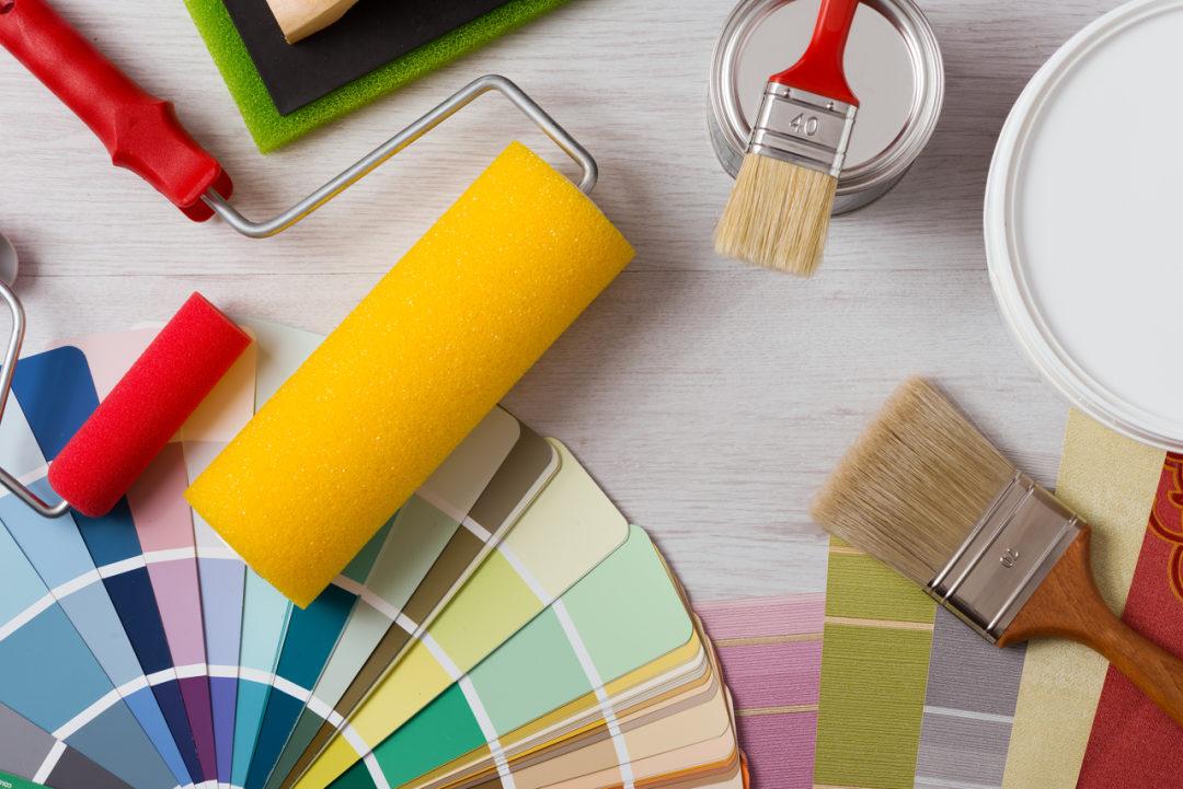
Color is the silent language of architecture, and color pastes are the notes that compose it.
01 From a Scientific Perspective: Color Principles as the Foundation of Color Matching
Let color embody technology, and let technology transform the environment.
Zhejiang Namei New Material Co., Ltd.
Any excellent color matching scheme is built on scientific color principles. The color wheel is a basic tool for designers. Adjacent color matching (such as blue + green) creates a harmonious and comfortable atmosphere, while complementary color matching (such as red + green) creates a strong visual impact – but the proportion must be strictly controlled to avoid clutter caused by large-area use.
Lightness and saturation are equally critical:
- Low-lightness color pastes (such as dark gray-blue) create a calm temperament, while high-lightness color pastes (such as light yellow) expand the sense of space.
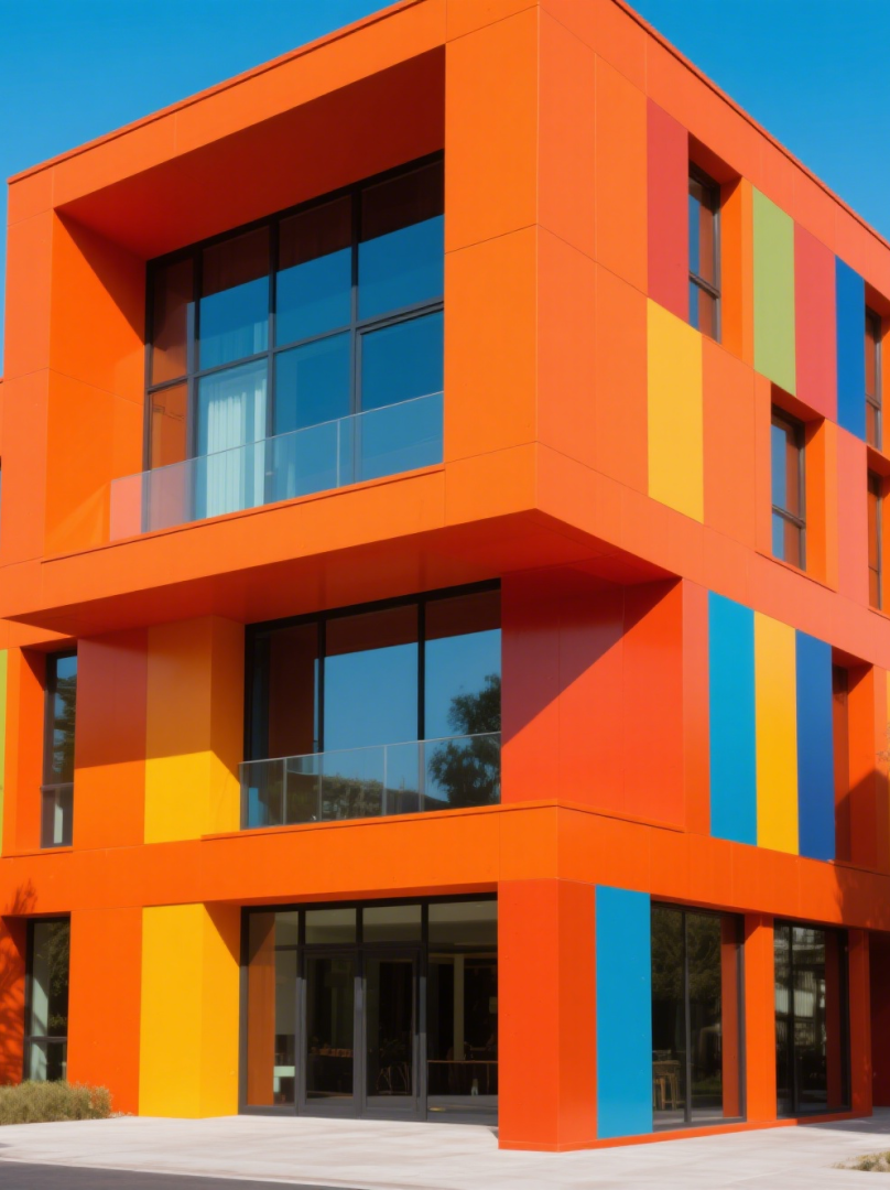
- High-saturation color pastes (bright orange) are lively and dynamic, while low-saturation color pastes (Morandi tones) are elegant and timeless.
02 From a Scenario Perspective: Space Function Determines the Color Tone
- Residential buildings: Neutral colors (beige, light gray) as the main tone, with local bright color pastes (Hermès orange) as accents; bedrooms recommend low-stimulus color systems (haze blue, bean paste green).
- Commercial spaces: Warm tones (terracotta red) are suitable for restaurants to enhance appetite; cool neutral colors (light gray-blue) are suitable for office spaces to improve concentration.
- Public buildings: Educational institutions can moderately use high-saturation colors (lemon yellow) to stimulate creativity, but avoid large-area use.
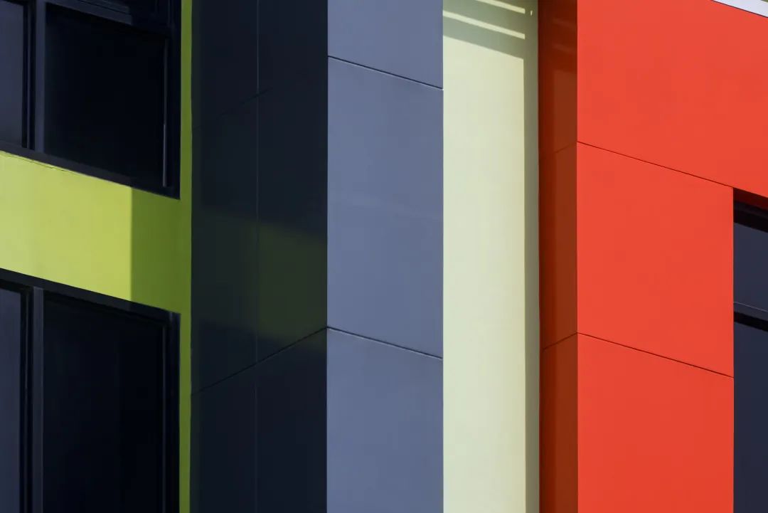
It is particularly important to note that the color of a single facade of a building should not exceed three types, with one main color tone and others in a subordinate position.
03 From a Material Perspective: Color Paste Properties Determine the Final Expressiveness
Let color embody technology, and let technology transform the environment.
Zhejiang Namei New Material Co., Ltd.
The same formula can present drastically different effects with different color paste materials:
- Inorganic color pastes: Strong weather resistance and stable colors, suitable for exterior walls and industrial styles.
- Organic color pastes: Vivid and full colors, but partial light resistance is slightly weaker, more suitable for indoor creative spaces.
- Environmentally friendly water-based color pastes: Low VOC content, meeting modern environmental protection requirements, made of high-quality pigments, additives, and water as highly dispersed pigment dispersions.
When selecting color pastes for exterior buildings, weather resistance must be considered. High-quality exterior color pastes should have a light resistance of grade 7-8 and weather resistance above grade 4-5. When compounding colors, try to select color pastes with similar weather resistance to avoid uneven fading due to performance differences.
04 From a Trend Perspective: The Color Future Where Environmental Protection and Technology Dance Together
Let color embody technology, and let technology transform the environment.
Zhejiang Namei New Material Co., Ltd.

The field of architectural color is undergoing a major transformation:
Environmental protection revolution: Zero-VOC color pastes have become the industry standard. As early as 2006, the industry standard Water-based Color Pastes for Architectural Coatings began to promote environmentally friendly color pastes. Modern consumers pay more attention to the environmental protection of color pastes, requiring no harmful substances such as APEO and ethylene glycol.
05 Professional Color Selection Guide: The Golden Rules for Color Paste Application
Let color embody technology, and let technology transform the environment.
Zhejiang Namei New Material Co., Ltd.
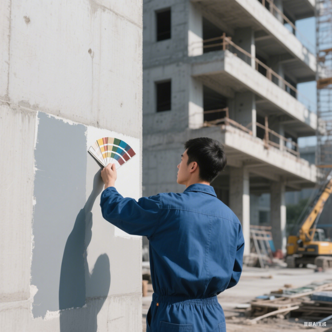
- On-site color testing is essential: Brush large color samples on the target wall and observe changes under different light throughout the day.
- Follow the 60-30-10 rule: 60% main color, 30% auxiliary color, and 10% accent color, with clear layers and no clutter.
- Use neutral colors for transition: When colors conflict, buffer with beige, light gray, or wood tones for more comfortable vision.
- Principle of cautious use of dark colors: Dark colors are only suitable for local accents (such as feature walls), and large-area use will increase costs by more than 30%.
- Quality first: Cooperate with technically certified manufacturers that strictly control quality to ensure the durability, environmental protection, and stability of color pastes.
A true color matching scheme is the symbiosis of scientific logic and aesthetic perception, and the perfect resonance between color paste quality and space needs. As a color solution provider, we adhere to innovation to provide architectural coatings with environmentally friendly, stable, and long-lasting color presentation.
Watercolor Pigments Manufacturer,Pigment Dispersion Technology,Color Matching Services


