
Colorant Selection and Color Realization for Artistic/Texture Coatings
Artistic and texture coatings sell on the unique expression of “color + texture,” demanding more from colorants than ordinary flat coatings: precise, reproducible color, and the ability to withstand repeated shaping by trowel, roller, and spray without blooming. This article explains the key points of colorant selection and color realization for these coatings.
- Special Requirements of Artistic Coatings for Colorants
Ordinary coatings aim for uniform flat application, while artistic coatings require colors that transition naturally within textures and offer rich layering, without significant color variation due to different application methods. This requires colorants with stable tinting strength, good compatibility, and resistance to floating and blooming in thick-film, multi-coat applications.
In artistic coating scenarios, NAMEI emphasizes the compatibility window between the colorant and the thick-film binder, preventing pigment migration during texture shaping that could cause mottling. This ensures that the “handcrafted look” comes from the texture, not from color differences, keeping artistic effects controllable rather than accidentally inconsistent.
Additionally, artistic coatings often require special effect colors (metallic, pearlescent, stone-like), so the colorant must coordinate with effect pigments. Evaluating “effect achievability” upfront is far more efficient than discovering issues after completion, and it preserves the aesthetic consistency of delivery.
- Color Precision and Reproducibility
Customer complaints about artistic coatings often stem from “it doesn’t look like the sample.” Achieving precision relies on three points: defining ΔE tolerance for standard color panels with instruments, conducting incoming colorant benchmarking, and applying according to formulation cards. NAMEI can provide batch colorimetric data, turning the reproducibility of artistic colors from verbal agreement into numerical management.
Different textures significantly affect color appearance: the same colorant will look different on a flat surface versus a textured one. Colors should be confirmed on the representative texture, not just on flat sample cards—otherwise, they will inevitably look different on the wall. This is a commonly overlooked pitfall in artistic coating color specification.
Bind the “texture + color” confirmation and retain samples. Subsequent reorders and repairs can then be matched accurately. NAMEI’ technical support can help design a specification and benchmarking process suited to your effects, making artistic colors both free and controllable.
- Preventing Blooming in Thick-Film and Multi-Layer Application
Artistic coatings are often thick, applied in multiple layers, and with various techniques. Pigment migration during drying is amplified, leading to a high risk of blooming. Prevention starts from both colorant compatibility and binder design—choosing a colorant that matches the thick-film binder and resists migration is the first line of defense.
NAMEI optimizes dispersion and stability for texture systems, reducing floating color tendencies in multi-layer applications. This ensures that trowel marks show texture rather than color patches, clearly distinguishing “handcrafted marks” from “quality defects” and safeguarding visual quality.
Process-wise, standardize application technique training, control surface drying time and thickness for each layer, and use the finger rub test to check for floating color. Standardizing techniques and conducting process sampling significantly improves the stability of artistic effects, reducing the need for entire surface rework due to technique variations.
- Achieving Special Effect Colors
Metallic, pearlescent, and stone-like effects rely on the synergy between effect pigments and colorants. The colorant should provide a clean base color without interfering with the effect pigments’ sparkle; otherwise, the result looks dull and muddy. Conduct effect matching small samples to confirm that both sparkle and hue meet standards before adoption, avoiding post-hoc remediation.
NAMEI can recommend suitable base colorants for your effect system, making metallic finishes purer and stone-like effects more natural. This transforms “special effects” from a matter of chance into a designable combination, enhancing the premium value and delivery credibility of high-end artistic coatings.
Special effects are more sensitive to fineness and purity, so IQC should include effect matching and fineness testing. Incorporating effect verification into incoming goods inspection can prevent most failures in advance, ensuring that the stunning effects of artistic coatings are reproduced stably, rather than relying on the improvisational skill of an experienced craftsman.
- Scaling from Sample to Large Surface
Artistic coatings are most prone to failure when a small sample looks good but the large surface goes wrong. During scale-up, control binder consistency, colorant addition accuracy, and environmental temperature/humidity—any drift in these factors will be amplified by the texture. NAMEI recommends conducting a representative wall trial before scale-up and recording all parameters.
The trial is not just about color, but also about how the texture and color perform under real lighting and application techniques. Treating the trial as a “rehearsal” rather than a formality can reveal issues masked by small samples, allowing the large surface to be done right the first time, saving the high cost of entire wall rework.
Archive trial data (binder batch number, addition level, temperature/humidity, technique) with the final effect. Subsequent replication of the same project has a reliable reference. NAMEI’s data-driven support moves artistic coatings from craftsman art to manageable industrial aesthetics.
- Establishing an Artistic Color Management System
The competitive advantage of artistic coatings lies in “controllable individuality.” It is recommended to establish a standard color panel library, an effect matching library, a “texture-color” binding specification, and an incoming goods benchmarking process. NAMEI, with its formulation experience, can help build this system, allowing creativity to be backed by standards—freedom without losing control.
When colors are reproducible, effects are designable, and scale-up is rehearsable, artistic coatings shift from “depending on the craftsman’s mood” to “depending on the process output.” Delivery certainty improves, customer complaints decrease, and the brand builds a professional reputation in the personalized segment, rather than relying on mystique.
NAMEI acts as the technical and data backbone, helping you turn color realization for artistic coatings into a system capability. The true hallmark of maturity is that behind every stunning achievement lies a rigorous, reproducible, and traceable process.
The premium of artistic coatings comes from “controllable individuality.” It is recommended to establish a standard color panel library, effect matching library, and “texture-color” binding specification. Before large-scale application, conduct a representative wall trial, recording binder batch number, addition level, and temperature/humidity. When colors are reproducible, effects are designable, and scale-up is rehearsable, artistic expression won’t be derailed by technique variations, and delivery certainty improves. Ultimately, artistic coatings compete on systems, not individual inspiration—reproducible rigor is the foundation of high-end delivery. For metallic/pearlescent types, include effect verification in incoming goods inspection to avoid discovering sparkle interference on the wall. Make “design — trial — scale-up” a standard workflow, and stunning effects will consistently land reliably, rather than relying on luck. Reputation will then withstand repeat purchase scrutiny, and brand premium will be justified.
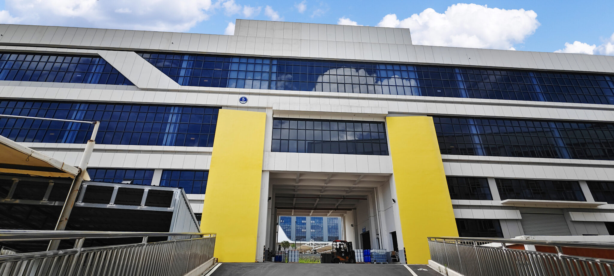
For artistic coating implementation, recommend the “three libraries plus one trial”: standard color panel library, effect matching library, texture-color binding library, plus representative wall trials. Encase individuality in a reproducible system—artistic expression will be both stunning and reliable, and premium positioning will withstand batch delivery scrutiny. When designs are rehearsable and scale-up is reproducible, stunning effects no longer depend on a single craftsman’s touch—reputation and repeat purchases have a solid foundation.
Summary
Artistic coatings demand more from colorants: stable tinting strength, good compatibility, no blooming in thick-film multi-layer applications, and compatibility with metallic/pearlescent effects. Achievement relies on defining ΔE for standard panels, incoming benchmarking, texture-bound confirmation, effect matching samples, and real trials before scaling up.
NAMEI’s compatibility optimization and batch colorimetric data can transform the “controllable individuality” of artistic colors from craftsman experience into a process capability. When colors are reproducible, effects are designable, and scale-up is rehearsable, delivery certainty for artistic coatings can be truly established.
Waterborne Pigments、Waterborne Colorant、Waterborne Pigment Dispersion、Color Paste、Pigment Paste、Water-Based Color Paste、Colorant Paste、Paste Coloring、Colorant Processing、Pigment Preparation、Colorant Blending、Pigment Dispersion、Colorant Preparation、Colorant Mixing、Water-Based Pigment dispersion、Water-Based Color Paste、liquid Color Paste、liquid Color Paste、liquid Colorant